Thursday, December 24, 2020

interference - Space and Time Magazine #139


Interference - Leonard Speiser. Space and Time Magazine, Anthony R. Rhodes

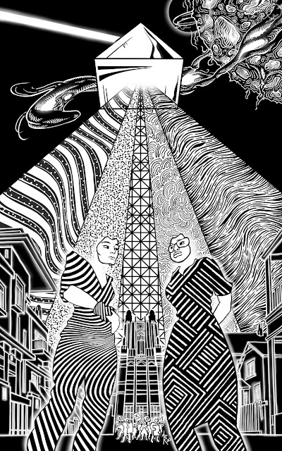
The challenge was to illustrate in black and white a story about colors.

The story, published in Space and Time Magazine (#139,) is titled "interference," written by Leonard Speiser.

It's a tale of science fiction where the characters are living beings of electromagnetic energy who live and work with some of the same biases and inequality we see in our own world. As the colors begin integrating, the world changes and some characters handle this change better than others.

It's a solid work of writing, thoughtful, with good momentum. It's also the first story I've illustrated where I had contact with the author about the artwork prior to publication. This story was considered somewhat abstract when the art was commissioned. There was also the challenge of working without color. This led the publishers to connect me with the author who had already shared the idea of using a large prism casting down a spectrum of light to help visualize the nature of this world. The prism was easy to integrate and, I feel, very effective. But this illustration was also the first time I had to worry about the possibility of disappointing an author, as I was unable to deliver on part of the vision he shared with me.

In his emails the author described how he pictured the characters as beings of energy, humanoid in shape but perhaps missing key human features like hands or mouths. He was also very good to link to images online which included faceless beings of bespeckled light. So, of course, my first sketches included faceless forms. Unfortunately, I wrestled with the results and ultimately just couldn't get them to work.

Later I realized that the reason faceless characters weren't working visually was because the story had a strong character focus. If this had been a tale of adventure with energy beings blasting through space, fighting monsters and discovering new worlds as its focus, illustrating the faceless characters would have worked perfectly well. But with Speiser's tale I kept feeling that the weight of character relationships and the sober societal themes of the story required an emotional focus for the reader to attach to. So I kept the faces and erased the heads instead.


The challenge of how to communicate color in a black and white drawing was almost immediately solved when the author proposed the idea of the prism. I would just translate colors to textures and give the sense of contrasting hue. So spilling out in this spectrum there are flag-like wavy lines, coarse static, linear scaffolding (like train-tracks?), curly fibers, and muscle sinew.

The bodies of the characters are themselves made up of only texture, a twisted optical illusion of curves for one and a more traditional, artful pattern of lines for the other. In the story one of the characters is a third generation immigrant and I chose a pattern that is meant to reflect the beauty and culture she carries with her.

The author and I also coordinated a few Easter eggs into the piece. One is the building at the distance seen between the two characters. In the story, this is The Factory. But it's shape and detail come directly from two real buildings found on the Wellesley College campus in
Massachusetts (namely the Tower Court building and the top of the Galen Stone Tower.) This was a nod to the author's wife who graduated from Wellesley and is herself a strong advocate in her community for equity and other noble causes.

Other inspirations for this illustration came from historic photos during the Civil Rights Movement, the science of prisms, 1980s shoulder glam, the lines of Fallingwater by F.L.W., and a tiny touch of The Grid from Tron. 


Saturday, September 26, 2020

Dead Time on Hart Island - Space and Time Magazine #138


When someone dies without family or friends to pay for their burial the responsibility often falls upon the state.

"Dead Time on Hart Island" is a warm, thoughtful ghost story written by author Barbara Krasnoff and published in the current issue of Space and Time Magazine (#138). The story takes place on a real world potters field located at the west end of Long Island Sound where for decades the unwanted and forgotten dead have been stacked atop one another in long cut trenches.

Interred on Hart Island are the indigent, the stillborn, the unclaimed, and the long forgotten. When the AIDS epidemic hit New York, Hart Island embraced many of its victims. Today as the Coronavirus kills hundreds of thousands, Hart Island is in steady use. There are even remains of confederate prisoners of war nestled in that soil.

The main character of Barbara's story is an inmate at Rikers Island Penitentiary. He is part of the detail of prisoners who work the island and inter the simple wooden coffins into the earth. It also happens that he converses with the dead.

"Dead Time at Hart Island" is one of those stories that feels as much about the setting as it is about the characters and events. Understanding the island and its history give weight to the story as it lays the foundations for the heavy themes which underlie an otherwise brief and lighthearted tale. 

Lucky for me there was plenty of information and pictures of the island available online and I was able to incorporate real things like buildings, machinery, and prisoner outfits into the illustration. For example, the bucket the central figure sits upon says "Harts Island" with an "s." Several of the reference photos I found included prisoners wearing jackets with this phrase hand painted on the back. I like what a little detail like that misspelling says about the attention, or lack thereof, the prison system gave to the island and it's workers.

Photos of Hart Island also informed the use of numbers in the illustration. In the real world numbered markers are scattered all over the island to denote mass grave sites. Each pit has a number as does each coffin. The coffins are stacked three or four high using the numbers to identify and catalog them.

Sketching to find the right feeling.

While the numbers I chose for the illustration were random, they are anything but insignificant. At The Hart Island Project (https://www.hartisland.net/burial_records/search) you'll find a webpage where you can actually search these plot numbers and see information about the people buried there. All of the marker numbers in the illustration are also on that website. You can type them into the search and see the names and sometimes personal information, pictures, and reminiscence of the people buried in that plot.

Without The Hart Island Project, a non-profit labor of love, most of those souls buried on the island would be forgotten completely. Just numbers in a field and on a page in a dusty log book.

The main character of the story notes several times that he expects to be buried on the island when he dies.

So in the illustration the numbers on the markers, the coffin, and the character's jacket are meant to be a visual association both about this man's fate with the island and a statement about the parallel dehumanization of the discarded dead and the state prisoners who lay them to rest.

As an added statement, the one thing in the illustration that actually does have a name is the large industrialized machine; “CASE” being a real brand of power shovel.

Often I wonder if it's better to reveal secrets or leave them to be discovered on their own.  In this illustration there's a character modeled after American author Dawn Powell (who was half Irish and who's remains are actually interred on Hart Island). Another character has a hint of Billy Porter in his style. There's a nativity feel to the cluster of figures in the upper half of the frame for which only my subconscious can take credit (this would've been enormously more amusing if the character's name had been Jesus). The opening notes were written by Sondheim.

The penguins are there for Barb.


Tuesday, July 7, 2020

After Altera - Space & Time Magazine #137

After Altera, Space and Time Magazine, Narnia, C S Lewis


After Altera is a refreshing new story by author Andrew Reichard, recently published in Issue #137 of Space and Time Magazine.

The story begins with a young girl climbing out of the old family wardrobe having spent a lifetime in the distant world beyond it. The story then focuses on the challenges and social isolation that result from having an adult brain in a child's body and the distant dysfunctional dynamics of the family the main character now suddenly finds herself reinserted into.

There's a moment in the middle of the story where the "girl" and a classmate with a developmental disability are talking and I very much wanted to use this for the illustration. I don't recall ever seeing a person with Down Syndrome, for example, illustrated in a magazine. It would have felt good to provide some representation for those families. I had the whole picture mapped out and there would have been elements of fantasy galleons in combat to keep things interesting. But in the end this would have been a very self-serving illustration and would not have honored what I thought was the core of Andrew's story; the intellectual isolation; the internalization and external social exile.

Putting the characters in one picture but distancing them visually and psychologically seemed a better option.

Sometimes I wonder if it's better to reveal secrets or leave them to be discovered on their own. In the illustration there's a forest, a lion, a light post, a very wardrobe-like mirror, apocalyptic stars, a particular college's team's logo, and more. The lighting and perspective lines for each of the characters are deliberately individualized to help visually isolate the players while they share the frame.

There was some difficulty getting the expression on the the girls face right. But eventually she came through (hopefully) looking pensive, longing, and like an old soul who's seen some shit in her lifetime(s).


After Altera

Friday, May 15, 2020

Flashlight, Knife and Flowered Crown: Completed

Anthony Rhodes, Sarah Avery
Click the image to view
With Sarah Avery's dark Fae serial fully published, I thought I would post all three images side-by-side. I've also gone back and updated each of the three blog posts with new information about colophons, hag stones, bed sheets, bearded dragons, and more. =)

Link to Part 1

Link to Part 2

Link to Part 3

Monday, April 6, 2020

Flashlight, Knife and Flowered Crown (Part 3)


The third dark Fae illustration is finished and with it my six-month journey living in Sarah Avery's serialized story Flashlight, Knife and Flowered Crown, currently published in issue #136 of Space and Time Magazine.

How fun it was to have this story fluttering around my brain. Dark faeries, dark deeds, and heroic and intelligent characters. Part 3 leads us deep into the Fae barrow where our heroine's courageous rescue attempt comes to it's dramatic conclusion.

I'd been looking forward to this part of the story. Early on I knew I wanted the faerie world to have some hint of art deco/art nouveau and that I was going to try throwing a little Harry Clarke inspired patters at it.


In some ways sketching is like auditioning actors.
 I love the sass of this fella but he just wasn't the Lump I was looking for.


However, it was a rough start. I was disappointed with my initial thumbnails but things started to fall in place when the background took form and, thankfully, the detailing pulled it through. I'd been looking at  Bernie Wrightson art lately and reading Junji Ito and I can see a little of each sneaking unannounced into parts of the illustration.

We're closer to the main characters now and it allows for more detail and the shading of the human figures to contrast more obviously with the lack of shading in the Fae. Perspective and dimension are deliberately thrown a little askew to give the barrow a slight disorienting feel.

Over the last year, as the three illustrations have been published, I've posted to Twitter and Facebook photos of the story's title page against a colorful patterned background. That patterned background was my bed sheets (I just sat the magazine on the bed). But from the beginning I knew that sort of flowered, curly textile was where I wanted to head. Here in the last illustration I was able to literally incorporate that pattern into, again, the background.

Sometimes I wonder if it's better to tell your secrets or to let someone discover them for themselves. Throughout the process of illustrating the three parts of this story I couldn't shake the feeling that these Fae characters were somehow connected to the history of the Imlen Brat, another universe written by Sarah Avery. I mean with a magic transporting mound that can appear anywhere (and perhaps any-when), who's to say? But for the life of me, I couldn't point the viewer to any particular clues across the illustrations, even if they were in fact there. Aren't the shape of the mistress's wings pretty and somehow familiar?

In the end, I think it's a strong finish to a strong story.

Flashlight, Knife, and Flowered Crown