Thursday, December 26, 2019

Flashlight, Knife and Flowered Crown (Part 2)


The second part in the "Flashlight, Knife and Flowered Crown" serial, written by Sarah Avery, has now been published in Space and Time Magazine issue #135 (Dec, 2019).

In the first illustration, I tried to capture the terror of having your child abducted by faerie. Here in the second illustration, I try to convey the gravity of that threat. The Fae do not take great care of their child-pets and dispose of their emaciated and mummified corpses in one of many vaults with their other broken treasures. Our hero must transverse one such vault on her journey into the faerie barrow to rescue her son.
Character sketch of our heroine in detail.

I decided to pull away from the characters and feature the room (that horrifying room). I will note that we are getting closer to the Fae characters as the illustrations progress. 

For a while I tried to feature the bearded dragon in the foreground, but couldn't get it to work.


One of the difficulties of working at this detail level is trying to make the illustration simple enough that it reads at the published 6x4 inch size. At last count, there were 72 tiny kiddie corpses in this illustration, then I added a few more where they were needed. Grandma always said you should never be stingie when sprinkling the landscape with malnourished infants and preteens. Each child is unique. Nina is there. Many have their own brief backstories.

I'll briefly share one such story.

--One of the children, one of the most beautiful the faerie had ever taken, had autism. This child refused to drink the nectar fed them, finding the texture beyond aversive. The nectar is what magically preserves the bodies of the children, and without it this child's has faded to nothing but bones.-- 

Sarah's story has elements of enchanted items, objects with attitudes and personality, and for the most part I never planned to feature this in any of the three illustrations but I was just able to hint at it here by putting frumpy faces into the background pillars.

I think I may have figured out why the children call him Toady.

Also scattered about are a number of broken art treasures from throughout mankind's history, from the Olmec to the Egyptians to pre-historic Peruvian Chancay dolls. Sarah and her family keep pet dragons and I thew a bearded one in for them (the fat rodent, however, is just there for a quick lunch).

For the illustrator, the most important words in the story.


Here too we begin seeing the transition I mentioned in my blog about Part 1; a transition into the textiles and shapes of the Fae world as we stand just outside the doorway to their realm. Next illustration should feature these type of forms prominently with the human characters maintaining the style established in the first two. We'll see if it all works.




Tuesday, December 17, 2019

More Adaptation


I'm calling this a life saver. Finally got around to wrapping my WACOM stylus so that I don't have to painfully hold my arthritic fingers to a tight point.

Tattoo artists do this often and I used some of their recommendations, going with medical tape as the main padding. It took a little getting used to and, at first, felt like drawing with one of those comically large novelty pencils. But by the end the results were obvious.

I managed to work on the illustration with little discomfort and no need for icing or pain relieving creme until the last three hours of work. Normally, I have to stop and take a break after two hours of drawing.

A big win for these achy digits.

Thursday, October 10, 2019

Flashlight, Knife and Flowered Crown (Part 1)

Sarah Avery, Space and Time Magazine #134


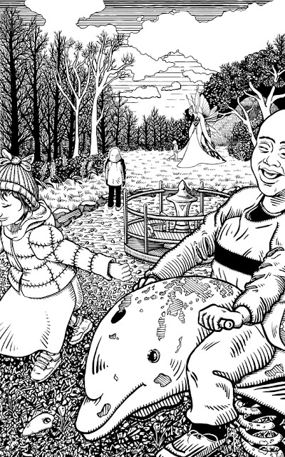
This is the first of a small set of illustrations I'm doing for the story Flashlight, Knife and Flowered Crown, written by the very talented Sarah Avery and published across the next few issues (#134-136) of Space and Time Magazine.

It's a story about faerie abduction and a badass mom prepared to do what is necessary to rescue her child.

It's a detailed, clever, and exciting tale with smart characters which is just as enjoyable on the third and fourth readings. The text is longer than usual, which is why it's being serialized across three issues. Upon being assigned to illustrate the first part of the story, I practically begged to illustrate the rest.

This will have been the first time I've done multiple illustrations for a single story. There were fleeting thoughts of how to integrate the set (a visual thread that connected the images when you placed them side by side in sequence) but this was abandoned when I realized, in order to avoid accidentally getting ahead of the story, I needed to know where the cuts were to occur across issues. This, of course, was no minor task for the publisher, Angela Yuriko Smith, requiring her to plan part of the magazine content several issues ahead of publication.

Eventually I decided to abandon interconnecting the set. In order to avoid jumping ahead of the story, I chose a moment which takes place sometime before the narrative begins --a playground, deceptively pleasant, but with something curious off in the distance. 


Early Fae sketch, too aggressive and inelegant.


While the illustration set will not interconnect, I did find a visual narrative to run through them, deciding that as the story progresses out of the modern world and into that of the Fae realm, I would transition the style. Hopefully, this will provide a nice otherworldly sense to the later half of the tale, and provide a unspoken contrast that these human creatures are not of this magic place. How well this will come across, we shall see. But taken as a set, I think it should work. This is why the fairy in this first illustration does not have the shading lines as the other characters. Things work differently in the realm of the Fae. It is also why I used a thicker pen for the modern world. It will help contrast the human characters later with their environment, and again, hopefully provide a sense of 'otherness.'


In the lower left corner of the illustration is a long, smooth hag stone. Why a hag stone? It's not part of the story as Sarah wrote it. Visually, I needed something in that space. Legend has it that hag/witch/adder stones, when viewed through the hole naturally formed within them, can reveal the hidden world of the Fae. I found it ever more tragic that the parent, who's point of view we take in the illustration, could have witnessed and perhaps even thwarted their child's abduction if only they'd known to look through that stone at their feet. Also, it fills that fucking gap in the lower left corner.

Sarah's story was so enjoyable on first read that I immediately pulled up Amazon and purchased her book The Imlen Brat with it's gorgeous illustrations and an memorable colophon of a seven-pointed crown over a jumping dolphin by Kate Baylay. I'd finished reading the book before I'd finished the illustration and there are a few less-than-subtle choices I made with that book in mind. Colophon is a lovely word, is it not?

Looking forward to continuing on this journey. I find it nice to have just one story to tumble around in my head over the next six months.


Monday, September 30, 2019

LAFFCON4 Poster

RA Lafferty, Reefs of Earth


Laffcon4 took place in June of 2019.

This year I had a bigger role in things than usual, taking responsibility for choosing and negotiating with presenters for the event and with contributors for the conference booklet. I organized an international Lafferty inspired poetry contest. I also managed the website & social media, did the layout, and published the program booklet. This year's poster was also mine

The visual theme was Lafferty's novel "The Reefs of Earth," about a family of goblin-like alien children Hell-bent on destroying humanity. The illustration had to be pulled together quickly. References were taken from pictures of Depression-era children. 

In the story there are six Dulanty children (seven if you count Bad John) [which I did not]. Working on the piece I began to realize that the imagery was coming across as too Holloween'ish. This led to the removal of the old dead tree painted into the background and my choice not to include Bad John, who is a ghost. 

Kevin Cheek will be organizing next year's event.
I'm looking forward to going back in 2020 and in focusing just on the artwork.
 

Wednesday, September 4, 2019

Adaptation


Just finished a new detailed illustration for Space and Time Magazine and, again, my hand was none too happy about it (osteoarthritis). So, in the spirit of adapting to getting older, I experimented with icing my hand every hour or so. It did nothing for the pain, but wonders for the redness and swelling. There's a creme for pain that works well. Next time, I'll try alternating heat and ice and I still need to find some foam or padding to wrap around the stylus so I don't have to squeeze quite so tightly.

The illustration will appear in issue #134, available for purchase in multiple formats on September 23, 2019.

Wednesday, March 20, 2019

Twisted-Up Things - Space and Time Magazine #133


Space and Time Magazine commissioned me for a second illustration. This time for a story by author Evey Brett titled "Twisted-Up Things."

Twisted-Up Things takes place in a fantasy world but with slightly more   technology than the average tale (shotguns and pocket knives exist). For me the story has notes of Shelly's Frankenstein and a more serious and personal undertone than the last illustration I did for Space and Time.

I had a lot of stops and starts with this one. I liked the characters and my first instinct was to illustrate my favorite scene when the main character finds their first semblance of peace and acceptance on an old farm. The illustration would have been in my usual cartoonish style and would have had shadow fey lingering in the shadows and corners of the frame. If it had been a book, I would have loved to have completed this illustration for the interior.


But then over the course of a few days the story began to sink in and I realized this scene was too calm and peaceful, wasn't necessarily going to visually draw in the viewer, and generally misrepresented the soul of the story. More importantly, I realized that my cartoonish style could not do the story, or the author, justice.

So I tried something new.

One of the best illustrated Frankenstein stories is Bernie Wrightston's Frankenstein. I've admired the detail and style of those images for a few years now and I loved the idea of trying to shade the image without crosshatching. Finally, I had a use for my old magnifying glass!


Eventually, I settled on the image of the main character curled in pain in a hay loft. Other elements from the story filled in the open spaces and even the shadow plays a purpose.

References were from Bernie's Frankenstein, old barns, fantasy spiders, Ren-Fair leatherwork, and some ancient and not so ancient symbols, but NOT any reference to actual hay. I was having just too much fun drawing squiggles to try and make it look like real hay. Plus, i decided, "You know what? Why wouldn't this hay be as twisted as anything else in the world? Those troublesome fae!" And that made everything better.

I'm very happy with the style experiment and proud of the illustration and to be a part of this story. The only drawback was that my hands were aching like all get out through the whole process. All those little lines took a tole on my osteoarthritis.

Worth it, though?
Absolutely.