Saturday, February 10, 2024

About - Back 2 OmniPark (Part 3)


Title Page for Back 2 OmniPark.

For most of the weekend trips I took with my friends to OmniPark there was drinking. This is before theme parks started checking your bags at the gate and you could still gain entrance with a water bottle full of vodka. You didn't want to get completely shitfaced on the grounds. There were too many kids. And while there wasn't a strong security presence on the premises, you always had the sense you were being watched. That said, being a little high made the rides more enjoyable. The Nebula Quest in particular could be quite jarring in parts and taking something to loosen you up beforehand helped. Also, OmniPark themes were heavily rooted in science and you needed at least a modicum of wits to navigate them.

Tales from OmniPark (the first OmniPark anthology) featured a number of artifacts and documents interspersed between the pages of the stories. Some of these elements were repurposed and reused throughout the book. With Back 2 OmniPark Ben wanted fresh content for each artifact. We spent about a week brainstorming ideas and researching theme park equipment and merchandise, putting an OmniPark twist on ideas. In total we came up with about 30 artifact concepts that could have made it into the book. With space and time limited only about 10 made it into print. My favorite of the unused ideas was a baby's onesie sold in The Realm of the Cell inked with the phrase, "The Focus is Mitosis." That one always made me smile.

Ben and I workshopped several of the artifacts, but there were a few that were eventually printed exactly as I presented them. The documents in the book were mostly unchanged. 

One artifact that surprised me was the little known (perhaps fake) scientific volume by Charles Darwin, "The Terrifying Awe of Unnatural Selection on the Development of Man and Related Species." We had a photo of the book which featured the text on the spine. But the editors asked if we could shift the focus to the front cover. None of us actually own a physical copy of the book and mysteriously it hasn't been available for purchase online since about 2014. The solution? Using the perspective tools available in Photoshop. I had to manipulate and pull the existing image to make it appear the book had changed position and angle, ...And what surprised me was how well that manipulation worked. 


Questionable Documents.

In addition to the artifacts we brainstormed, Ben had a number of photos taken from inside the park and a few pictures of the original managerial staff and engineers, which Dalton Teague termed his Technosophers. Once we had the artifacts ready for presentation it was time to move to the next phase, design elements.

One of Ben's favorite anthologies was Lovecraft's Monsters, edited by the unstoppable Ellen Datlow with art and design by John Coulthart. This book was a constant touchstone for Back 2 Omnipark. The primary design elements that needed to be created were a title graphic, contents page, chapter title graphic, and the a detailed map of Omnipark to sit at the beginning of the book. There was a little more time to work on these elements than there had been for the illustrations, and I was able to add a lot more shadow and detail. 


Sketches for illustrations and artifacts.

The map in particular was fun to create, cementing the outward shapes of buildings and the structures of the park. There were a few elements of the map we had to just make up on our own. Most of OmniPark is indoors, inclosed in the pavilions of the realms or within its climate controlled connecting tunnels. You never really got to see the exterior of the park while at the park. And there wasn't much that could be seen from the parking garage before you entered. There are quite a few theories that propose the park was actually much larger than it appeared on maps and structural documents.

The next phase was layout. Again, I'd designed hundreds of pages for magazines, but this was my first book. I'm happy to say, for the most part, all went well. I owe a lot of thanks to Adobe InDesign, for making the process simple. Designing the interior of a book goes fast, especially compared to a magazine. Magazines have lots of pictures, graphic elements, and advertisements that push and take up space with the text. But in a book, once the text starts, it rarely get's interrupted. If there was a trick to the process it was trying to minimize "widows and orphans." Preparing and converting the book, with all its illustrations and artifacts,  for the ebook format was also a grand learning experience. I'm happy to brag that most of the files uploaded into the printers website with few red flags or kickback. 

The editors and I designed the back cover layout, a poster, a few t-shirts and then we were off to the printers.


The last time I visited Omnipark there was an invisible cloud of dread throughout the park. Dalton Teague had been dead for two years or so and while his wife had maintained all that they had created, you couldn't help but feel the spark that fueled the park had smoldered. Cell phones, digital cameras, and the internet were becoming more common and influential. Omnipark never seemed to want to be a part of that global visibility. As far as I know it never had a dedicated website. So it was nice after all these years to work on this book and put to print a record of some of those personal memories (even if not all of them are perfectly believable.)


15 Illustrations for 15 Stories in Back 2 OmniPark


Back 2 OmniPark is available for purchase on Amazon and where books are commonly sold.


Saturday, February 3, 2024

About - Back 2 OmniPark (Part 2)


Illustrator for Back 2 OmniPark.

During one of my first trips to the real OmniPark I purchased a hardcover book sold in The Realm of Time bookshop. The book appeared ancient but the materials and quality were like new. It smelled off, like a pile of wet leaves. I remember the cover was attractive, an image of a colossal multi-eyed Lovecrafian style monster hovering over a rocky mountain peak. The book was further illustrated in its interior. I've forgotten the title, which was a rather long single word, but when I brought it home I realized it was a book about religion. Or perhaps more accurately, about strategically pulling together the threads of ideas one could use to create and shape a new mythology. An odd thing to find in an theme park. But typical for OmniPark. Mainly I remember the pictures.

Co-editor Ben Thomas informed me we had five months until the publication of Back 2 OmniPark. At the time I thought, "That's wonderful! Plenty of time to layout the book." I started digging online, investigating the differences between book files and magazine files, trying to identify the areas where I might need to better educate myself (flowable ePubs in particular were going to be new territory.) From the beginning I was upfront with the editors concerning my limitations and weaknesses.


Map of OmniPark at the front of the anthology.

Part of designing the book included constructing what the editors categorized as "Artifacts" (realistic images or photographs of objects related to the park.) This mainly included merchandise and documents. We brainstormed somewhere around 30 ideas with about 10 of them making it into the book. Some great artifacts went unused. If there had been more time we'd have included more. Ben has an extensive collection of documents (most copies of originals) relating to the real OmniPark, which he says he's collected mainly from chat rooms, discussion boards, and small town Texas libraries. Many of these are obvious fakes. Or if not fake, too absurd to be believed by the average reader without corroborative evidence. For my part, I tried to chose artifacts which represented the flavor and subtle humor of the park. 

I suspect during this time the editors discovered that I was also an illustrator. I was asked if, in addition to the layout, I would be willing to do illustrations for the 15 stories in the anthology. 

...and I immediately declined. 

The average illustration takes me 3 weeks to complete. There was no way I could produce 15 illustrations in the 5-month window, even if that were my sole focus during the time. And even attempting to do so would have destroyed my hands thanks to arthritis. I recommended they contact another artist, but they asked me again, pointing out that they would rather work with just one person than try to coordinate multiple contributors and slow things down. They said any little bit of artwork would be enough, so long as it was something original for each story. I thought about it, weighed the opportunity to illustrate a book and then agreed to provide the art under the condition that the illustrations be in a much less detailed style than what I normally produce. We chatted about it a bit and eventually picked a simplified, cut-out style of artwork similar to the early poster art and advertisements for EPCOT and Tomorrowland --Solid shapes, few details, with little-to-no-shading. 

I was asked to present a couple of sketches for the first stories. My sketches are pitiful (for evidence just look through earlier posts in this blog) and often underrepresent the finished products. Since these editors didn't know me, instead I presented two nearly finished illustrations. They seemed to like them and I was told I didn't need to show anymore sketches. They trusted me. 

Illustration page from the published hardcover edition of Back to OmniPark.


For two months I produced two illustrations a week, sometimes spending as much as 20 hours over the weekend shut in the office. Most weekdays I would come home from my day job to work on the illos. But I did so with excitement. I knew there was something special about OmniPark. Creative choices needed to be made quickly to keep to the publication deadline. My main rule while illustrating was to find a moment in the story that was evocative and true to the story's details and, above all else, avoided spoiling the ending (which is often more difficult than it sounds.) I would upload two illos to a shared Google drive where the editors could see them and immediately move on to the next two. I liked imagining Ben and Alicia checking that folder periodically and finding the new images that had been added. 

When all 15 illustrations were submitted it felt like quite an accomplishment. But there was little time to relax. I had to change modes and begin work creating the real world Artifacts for the book. 


[More about Back 2 OmniPark in Part 3]

Back 2 OmniPark is available for purchase on Amazon and where books are commonly sold.


Friday, January 12, 2024

About - Back 2 OmniPark (Part 1)

 Back 2 OmniPark was officially published on December 15, 2023 and for five months prior I worked on layout design and illustrations for the book. 

Back 2 OmniPark is the horror anthology prequel to 2021's Tales from OmniPark, which made the preliminary ballot for a Bram Stoker award. B2O has original stories by authors such as from Jonathan Maberry, Laird Barron, Hailey Piper, Brian Evenson, Kristi DeMeester, Angela Yuriko Smith and more. 


The two currently available books in the OmniPark series.

I was brought onto the project after the Kickstarter had concluded and stories were already written and edited. Ben Thomas (co-editor of the book with Alicia Hilton) was searching for a new layout designer and Angela Yuriko Smith (owner of Space and Time Magazine) suggested me as a possibility.

I had edited years of issues of the S&T magazine, with its illustrations and abundance of high graphic page layouts. But I'd never done layout for a book before. Considering how simple the graphic layout is in most books, I thought I'd have an easy job of it. Well, Ben had a surprise for me.

The first thing I was asked to do was catch-up on OmniPark history and theories, which included reading the OmniPark Wiki and all the stories from the first anthology. OmniPark was a Texas theme park (not an amusement park) similar to EPCOT but with more realistic, grounded, and scientific themes that could sometimes be perceived as unsettling.

At no point during the making of the book was I asked if I'd heard of the real OmniPark. In fact, I went to graduate school at UNT in Denton, TX (just 5 hours and 356 miles from Odessa) and I'd made several weekend visits to the park with friends between 1998 and 2002. The last time I was there a random person thanked me for everything I'd done for the park. I figured it was just one of those things; like when someone mistakes you for a grocery store clerk and asks where they can find the oleo. Part of me can't help but wonder now if they were referring to my future work on this book. Unusual occurrences often took place while at OmniPark.

A week after coming on board with the book I was asked to construct a vision board --A test to see if my concept of the look and feel of the park matched those of the editors. This was easy since I remember the park well and Ben was pleasantly surprised at how in sync we were with his vision. I ended up making two large boards using hundreds of photos from the internet (a few of which I subtly modified.)


Vision board for the outward facing OmniPark.

 One board was meant to represent the fun, stimulating outer face of the park. The other was meant to represented its dark conspiratorial mythos. The only real mistake I made was including in my collage a small photo I'd found online of children playing inside a hollow shark statue, which Ben quickly identified as being far too cartoonish for OmniPark. And he was absolutely right. 


The "Dark Disney" vision board.

This, I believe, was enough for them to trust me with the layout of the book and, as I would later come to find out, with creative contributions that would shape the overall world of the anthologies. 

I'll write more about making Back 2 OmniPark soon. In the meantime you can purchase the book in multiple formats through Amazon, Barnes & Noble, and where books are sold. 


Wednesday, December 20, 2023

Back 2 OmniPark is Published

The prequel anthology Back 2 OmniPark was published last week and I had a heavy hand in piecing it all together. There's more to write about OmniPark but I think I'll save that for the next post. 

In the meantime, Back 2 OmniPark is currently available on Amazon and at Barnes & Noble in multiple formats. 

https://www.amazon.com/Back-2-OmniPark-Ben-Thomas/dp/B0CPX1ZGWQ/


Back 2 OmniPark, edited by Ben Thomas and Alicia Hilton and published by House Blackwood, is an anthology of horror short stories that explore the mysterious backstory behind OmniPark's creation.

This anthology features brand-new exclusive stories by some of the biggest names in the horror genre ⁠- including: 

Jonathan Maberry, Laird Barron, 

Hailey Piper, Brian Evenson, 

Kristi DeMeester, John Palisano, 

A.C. Wise, Gwendolyn Kiste

Angela Yuriko Smith

and many more award-winning masters of the macabre.


Monday, July 19, 2021

The Glass House - Space and Time Magazine #141


Today the bones of Milner Mansion lay in ruins. The great house, built by Titus Salt, Jr. in Bingley, UK around the Victorian Era, has it's own tragic tales and mysteries.  Those living in the area inherit, if they choose, the lore of the mansion, access to the field where it stood, and may explore the rubble of brick, mosaic floor and what remains of its once great glasshouse floor.

Author Alyson Faye has planted her Gothic horror story "The Glass House" (published in Issue #141 of Space and Time Magazine) at Milner Mansion, back when the walls and the greenhouse stood strong. This is not Faye's first literary venture into the setting (see Night of the Rider by Demain Publishing.)

The Glass House is a story of maddening inheritance and monstrous responsibilities. It's slightly unsettling to read and a delightful indulgence.

For the magazine publication, I was fortunate to provide the illustration. In the few years I've been working with Space & Time, I've been secretly dying to illustrate horror. Still, I was apprehensive that I would find it too difficult to capture the tone of a dark tale within the limitations of my cartoonish style. Having completed the projected, I  feel more confident, or at least hopeful, that those fears were unnecessary.

I spent some time referencing pulp horror illustrations, leafing trough digital volumes of Weird Tales and exploring techniques used by illustrators during the Victorian Era. All the while pulling from these works elements I hoped would incorporate well with my own style.

I collected reference photos for costume, props, and even planters appropriate for the period. As usual, there were four times as many unused references as there were included. But that is always part of the fun, discovering which pieces in the pile actually fit this particular puzzle. I also found a handful of visual references for the mansion and imagined the perspective one would take looking upon the house from inside the greenhouse. 

Within the illustration there is a fetus-bean, a horned rider with hounds, reference to the rare Cypripedium Calceolus "lady's slipper" orchid of the Yorkshire Dales, a juvenile potted triffid (of the Penguin Books "hairy pineapple" variety,) --which I suspect the botanist father in the story might have been using in his experiments (big gasp.) Also, included is a nod and a bow to both the great Milner Field house as it once stood and how one would find it today.

May the mansion's legacy live on, fueled by the fascination and imagination of ones such as the talented Alyson Faye.


Monday, March 22, 2021

The Hum of the Wheel, the Clack of the Loom - Space & Time Magazine #140


K G Anderson, Space and Time Magazine, Iceland

As I write this Fagradalsfjall is erupting not too far from the airport near Rekjavik, Iceland. Don't worry, they're fairly used to it.

At the same time the Spring issue of Space and Time Magazine is being released featuring the story The Hum of the Wheel, the Clack of the Loom, for which I was fortunate to provide an illustration. The story is high fantasy, written by an author who lives near the Scandinavian fishing community of Seattle and who's last name happens to be Anderson. 

Therefore, before even reading two paragraphs into the story, I knew I'd be adding some Nordic elements to the illustration.

In The Hum of the Wheel, the Clack of the Loom, K. G. Anderson has created an insightful, beautifully written, interpersonal fantasy. The themes layered into the story of a man who's fallen into a relationship with a fairy are both timely and timeless. A cautionary tale for those readers still brave enough to open themselves to finding love in times of social strife.

The story is very effective in it's intent, resonating with a specific frequency for those of us just coming out of the political atmosphere of 2020, but still universally human enough to be heard by generations to come.

Sofhars sketch with their alternating shearing schedule

For the illustration I tried something different, playing with greasy grays and watercolor effects. I spent a good amount of time admiring the works of Swedish illustrator John Bauer and learning about the historic deforestation of Iceland.

In the illustration are stone cairns, a fantasy version of the turf house, Faldbúningur and Þjóðbúningur karla, vegetation that includes rowan trees, Icelandic birch, and the invasive lupine (but also elephant ears and donkey tails.) There are three ne'er-do-wells lurking at the bridge, one of which an insurrectionist shaman (which I only hope in years to come will be a lost reference.)

I'm curious to see how the new techniques print. What works and what does not.

Meanwhile, there's fresh lava on the island. I dream of Iceland often. It didn't feel like home while visiting but, years later, I wish that one day it could be.


Wednesday, February 10, 2021

Arthritis Update


It's been a little while since I've written about my arthritis. While the progression and the loss are (thankfully) slow, I'm noticeably worse off with each new year than I was in the previous.

In regards to my art, most of the accommodations I have made (and blogged about here) have minimized the discomfort and allowed me to focus on the creativity rather than managing the pain.

Outside of that, I get aches in my hips, shoulders, knees, and neck now. Deep aches that are easy to be distracted from during the business of the day but hound me at night.  There are hot Florida nights where I sleep with a heating pad loosely wrapped around some body part. There are moments when I get up for a drink and hobble like an old man into the kitchen.

Even when playing video games (a hobby I realize I will also, regrettably, someday have to give up), I must adapt to the limitations of my hands and the strength left in my fingers. For example, I find now in many games where a selection of weapons are available I  only use automatic weapons where I can just hold down the trigger to fire or high powered weapons like sniper rifles, where one shot does the trick.

I tell myself, "Celebrate. These are still the good years."

Thursday, December 24, 2020

interference - Space and Time Magazine #139


Interference - Leonard Speiser. Space and Time Magazine, Anthony R. Rhodes

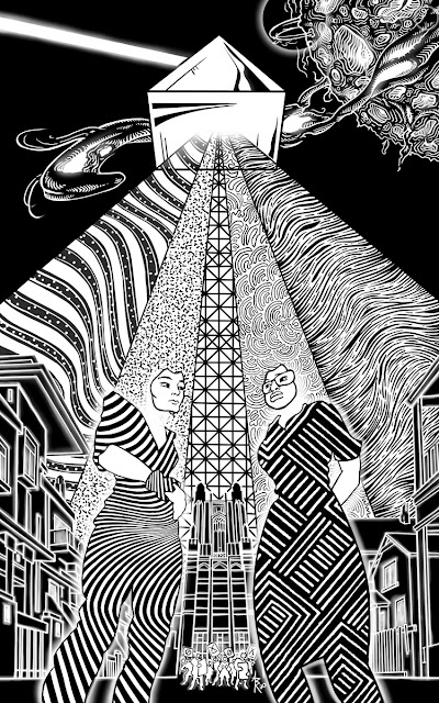
The challenge was to illustrate in black and white a story about colors.

The story, published in Space and Time Magazine (#139,) is titled "interference," written by Leonard Speiser.

It's a tale of science fiction where the characters are living beings of electromagnetic energy who live and work with some of the same biases and inequality we see in our own world. As the colors begin integrating, the world changes and some characters handle this change better than others.

It's a solid work of writing, thoughtful, with good momentum. It's also the first story I've illustrated where I had contact with the author about the artwork prior to publication. This story was considered somewhat abstract when the art was commissioned. There was also the challenge of working without color. This led the publishers to connect me with the author who had already shared the idea of using a large prism casting down a spectrum of light to help visualize the nature of this world. The prism was easy to integrate and, I feel, very effective. But this illustration was also the first time I had to worry about the possibility of disappointing an author, as I was unable to deliver on part of the vision he shared with me.

In his emails the author described how he pictured the characters as beings of energy, humanoid in shape but perhaps missing key human features like hands or mouths. He was also very good to link to images online which included faceless beings of bespeckled light. So, of course, my first sketches included faceless forms. Unfortunately, I wrestled with the results and ultimately just couldn't get them to work.

Later I realized that the reason faceless characters weren't working visually was because the story had a strong character focus. If this had been a tale of adventure with energy beings blasting through space, fighting monsters and discovering new worlds as its focus, illustrating the faceless characters would have worked perfectly well. But with Speiser's tale I kept feeling that the weight of character relationships and the sober societal themes of the story required an emotional focus for the reader to attach to. So I kept the faces and erased the heads instead.


The challenge of how to communicate color in a black and white drawing was almost immediately solved when the author proposed the idea of the prism. I would just translate colors to textures and give the sense of contrasting hue. So spilling out in this spectrum there are flag-like wavy lines, coarse static, linear scaffolding (like train-tracks?), curly fibers, and muscle sinew.

The bodies of the characters are themselves made up of only texture, a twisted optical illusion of curves for one and a more traditional, artful pattern of lines for the other. In the story one of the characters is a third generation immigrant and I chose a pattern that is meant to reflect the beauty and culture she carries with her.

The author and I also coordinated a few Easter eggs into the piece. One is the building at the distance seen between the two characters. In the story, this is The Factory. But it's shape and detail come directly from two real buildings found on the Wellesley College campus in
Massachusetts (namely the Tower Court building and the top of the Galen Stone Tower.) This was a nod to the author's wife who graduated from Wellesley and is herself a strong advocate in her community for equity and other noble causes.

Other inspirations for this illustration came from historic photos during the Civil Rights Movement, the science of prisms, 1980s shoulder glam, the lines of Fallingwater by F.L.W., and a tiny touch of The Grid from Tron. 


Saturday, September 26, 2020

Dead Time on Hart Island - Space and Time Magazine #138


When someone dies without family or friends to pay for their burial the responsibility often falls upon the state.

"Dead Time on Hart Island" is a warm, thoughtful ghost story written by author Barbara Krasnoff and published in the current issue of Space and Time Magazine (#138). The story takes place on a real world potters field located at the west end of Long Island Sound where for decades the unwanted and forgotten dead have been stacked atop one another in long cut trenches.

Interred on Hart Island are the indigent, the stillborn, the unclaimed, and the long forgotten. When the AIDS epidemic hit New York, Hart Island embraced many of its victims. Today as the Coronavirus kills hundreds of thousands, Hart Island is in steady use. There are even remains of confederate prisoners of war nestled in that soil.

The main character of Barbara's story is an inmate at Rikers Island Penitentiary. He is part of the detail of prisoners who work the island and inter the simple wooden coffins into the earth. It also happens that he converses with the dead.

"Dead Time at Hart Island" is one of those stories that feels as much about the setting as it is about the characters and events. Understanding the island and its history give weight to the story as it lays the foundations for the heavy themes which underlie an otherwise brief and lighthearted tale. 

Lucky for me there was plenty of information and pictures of the island available online and I was able to incorporate real things like buildings, machinery, and prisoner outfits into the illustration. For example, the bucket the central figure sits upon says "Harts Island" with an "s." Several of the reference photos I found included prisoners wearing jackets with this phrase hand painted on the back. I like what a little detail like that misspelling says about the attention, or lack thereof, the prison system gave to the island and it's workers.

Photos of Hart Island also informed the use of numbers in the illustration. In the real world numbered markers are scattered all over the island to denote mass grave sites. Each pit has a number as does each coffin. The coffins are stacked three or four high using the numbers to identify and catalog them.

Sketching to find the right feeling.

While the numbers I chose for the illustration were random, they are anything but insignificant. At The Hart Island Project (https://www.hartisland.net/burial_records/search) you'll find a webpage where you can actually search these plot numbers and see information about the people buried there. All of the marker numbers in the illustration are also on that website. You can type them into the search and see the names and sometimes personal information, pictures, and reminiscence of the people buried in that plot.

Without The Hart Island Project, a non-profit labor of love, most of those souls buried on the island would be forgotten completely. Just numbers in a field and on a page in a dusty log book.

The main character of the story notes several times that he expects to be buried on the island when he dies.

So in the illustration the numbers on the markers, the coffin, and the character's jacket are meant to be a visual association both about this man's fate with the island and a statement about the parallel dehumanization of the discarded dead and the state prisoners who lay them to rest.

As an added statement, the one thing in the illustration that actually does have a name is the large industrialized machine; “CASE” being a real brand of power shovel.

Often I wonder if it's better to reveal secrets or leave them to be discovered on their own.  In this illustration there's a character modeled after American author Dawn Powell (who was half Irish and who's remains are actually interred on Hart Island). Another character has a hint of Billy Porter in his style. There's a nativity feel to the cluster of figures in the upper half of the frame for which only my subconscious can take credit (this would've been enormously more amusing if the character's name had been Jesus). The opening notes were written by Sondheim.

The penguins are there for Barb.


Tuesday, July 7, 2020

After Altera - Space & Time Magazine #137

After Altera, Space and Time Magazine, Narnia, C S Lewis


After Altera is a refreshing new story by author Andrew Reichard, recently published in Issue #137 of Space and Time Magazine.

The story begins with a young girl climbing out of the old family wardrobe having spent a lifetime in the distant world beyond it. The story then focuses on the challenges and social isolation that result from having an adult brain in a child's body and the distant dysfunctional dynamics of the family the main character now suddenly finds herself reinserted into.

There's a moment in the middle of the story where the "girl" and a classmate with a developmental disability are talking and I very much wanted to use this for the illustration. I don't recall ever seeing a person with Down Syndrome, for example, illustrated in a magazine. It would have felt good to provide some representation for those families. I had the whole picture mapped out and there would have been elements of fantasy galleons in combat to keep things interesting. But in the end this would have been a very self-serving illustration and would not have honored what I thought was the core of Andrew's story; the intellectual isolation; the internalization and external social exile.

Putting the characters in one picture but distancing them visually and psychologically seemed a better option.

Sometimes I wonder if it's better to reveal secrets or leave them to be discovered on their own. In the illustration there's a forest, a lion, a light post, a very wardrobe-like mirror, apocalyptic stars, a particular college's team's logo, and more. The lighting and perspective lines for each of the characters are deliberately individualized to help visually isolate the players while they share the frame.

There was some difficulty getting the expression on the the girls face right. But eventually she came through (hopefully) looking pensive, longing, and like an old soul who's seen some shit in her lifetime(s).


After Altera

Friday, May 15, 2020

Flashlight, Knife and Flowered Crown: Completed

Anthony Rhodes, Sarah Avery
Click the image to view
With Sarah Avery's dark Fae serial fully published, I thought I would post all three images side-by-side. I've also gone back and updated each of the three blog posts with new information about colophons, hag stones, bed sheets, bearded dragons, and more. =)

Link to Part 1

Link to Part 2

Link to Part 3

Monday, April 6, 2020

Flashlight, Knife and Flowered Crown (Part 3)


The third dark Fae illustration is finished and with it my six-month journey living in Sarah Avery's serialized story Flashlight, Knife and Flowered Crown, currently published in issue #136 of Space and Time Magazine.

How fun it was to have this story fluttering around my brain. Dark faeries, dark deeds, and heroic and intelligent characters. Part 3 leads us deep into the Fae barrow where our heroine's courageous rescue attempt comes to it's dramatic conclusion.

I'd been looking forward to this part of the story. Early on I knew I wanted the faerie world to have some hint of art deco/art nouveau and that I was going to try throwing a little Harry Clarke inspired patters at it.


In some ways sketching is like auditioning actors.
 I love the sass of this fella but he just wasn't the Lump I was looking for.


However, it was a rough start. I was disappointed with my initial thumbnails but things started to fall in place when the background took form and, thankfully, the detailing pulled it through. I'd been looking at  Bernie Wrightson art lately and reading Junji Ito and I can see a little of each sneaking unannounced into parts of the illustration.

We're closer to the main characters now and it allows for more detail and the shading of the human figures to contrast more obviously with the lack of shading in the Fae. Perspective and dimension are deliberately thrown a little askew to give the barrow a slight disorienting feel.

Over the last year, as the three illustrations have been published, I've posted to Twitter and Facebook photos of the story's title page against a colorful patterned background. That patterned background was my bed sheets (I just sat the magazine on the bed). But from the beginning I knew that sort of flowered, curly textile was where I wanted to head. Here in the last illustration I was able to literally incorporate that pattern into, again, the background.

Sometimes I wonder if it's better to tell your secrets or to let someone discover them for themselves. Throughout the process of illustrating the three parts of this story I couldn't shake the feeling that these Fae characters were somehow connected to the history of the Imlen Brat, another universe written by Sarah Avery. I mean with a magic transporting mound that can appear anywhere (and perhaps any-when), who's to say? But for the life of me, I couldn't point the viewer to any particular clues across the illustrations, even if they were in fact there. Aren't the shape of the mistress's wings pretty and somehow familiar?

In the end, I think it's a strong finish to a strong story.

Flashlight, Knife, and Flowered Crown


Thursday, December 26, 2019

Flashlight, Knife and Flowered Crown (Part 2)


The second part in the "Flashlight, Knife and Flowered Crown" serial, written by Sarah Avery, has now been published in Space and Time Magazine issue #135 (Dec, 2019).

In the first illustration, I tried to capture the terror of having your child abducted by faerie. Here in the second illustration, I try to convey the gravity of that threat. The Fae do not take great care of their child-pets and dispose of their emaciated and mummified corpses in one of many vaults with their other broken treasures. Our hero must transverse one such vault on her journey into the faerie barrow to rescue her son.
Character sketch of our heroine in detail.

I decided to pull away from the characters and feature the room (that horrifying room). I will note that we are getting closer to the Fae characters as the illustrations progress. 

For a while I tried to feature the bearded dragon in the foreground, but couldn't get it to work.


One of the difficulties of working at this detail level is trying to make the illustration simple enough that it reads at the published 6x4 inch size. At last count, there were 72 tiny kiddie corpses in this illustration, then I added a few more where they were needed. Grandma always said you should never be stingie when sprinkling the landscape with malnourished infants and preteens. Each child is unique. Nina is there. Many have their own brief backstories.

I'll briefly share one such story.

--One of the children, one of the most beautiful the faerie had ever taken, had autism. This child refused to drink the nectar fed them, finding the texture beyond aversive. The nectar is what magically preserves the bodies of the children, and without it this child's has faded to nothing but bones.-- 

Sarah's story has elements of enchanted items, objects with attitudes and personality, and for the most part I never planned to feature this in any of the three illustrations but I was just able to hint at it here by putting frumpy faces into the background pillars.

I think I may have figured out why the children call him Toady.

Also scattered about are a number of broken art treasures from throughout mankind's history, from the Olmec to the Egyptians to pre-historic Peruvian Chancay dolls. Sarah and her family keep pet dragons and I thew a bearded one in for them (the fat rodent, however, is just there for a quick lunch).

For the illustrator, the most important words in the story.


Here too we begin seeing the transition I mentioned in my blog about Part 1; a transition into the textiles and shapes of the Fae world as we stand just outside the doorway to their realm. Next illustration should feature these type of forms prominently with the human characters maintaining the style established in the first two. We'll see if it all works.


Tuesday, December 17, 2019

More Adaptation


I'm calling this a life saver. Finally got around to wrapping my WACOM stylus so that I don't have to painfully hold my arthritic fingers to a tight point.

Tattoo artists do this often and I used some of their recommendations, going with medical tape as the main padding. It took a little getting used to and, at first, felt like drawing with one of those comically large novelty pencils. But by the end the results were obvious.

I managed to work on the illustration with little discomfort and no need for icing or pain relieving creme until the last three hours of work. Normally, I have to stop and take a break after two hours of drawing.

A big win for these achy digits.

Thursday, October 10, 2019

Flashlight, Knife and Flowered Crown (Part 1)

Sarah Avery, Space and Time Magazine #134


This is the first of a small set of illustrations I'm doing for the story Flashlight, Knife and Flowered Crown, written by the very talented Sarah Avery and published across the next few issues (#134-136) of Space and Time Magazine.

It's a story about faerie abduction and a badass mom prepared to do what is necessary to rescue her child.

It's a detailed, clever, and exciting tale with smart characters which is just as enjoyable on the third and fourth readings. The text is longer than usual, which is why it's being serialized across three issues. Upon being assigned to illustrate the first part of the story, I practically begged to illustrate the rest.

This will have been the first time I've done multiple illustrations for a single story. There were fleeting thoughts of how to integrate the set (a visual thread that connected the images when you placed them side by side in sequence) but this was abandoned when I realized, in order to avoid accidentally getting ahead of the story, I needed to know where the cuts were to occur across issues. This, of course, was no minor task for the publisher, Angela Yuriko Smith, requiring her to plan part of the magazine content several issues ahead of publication.

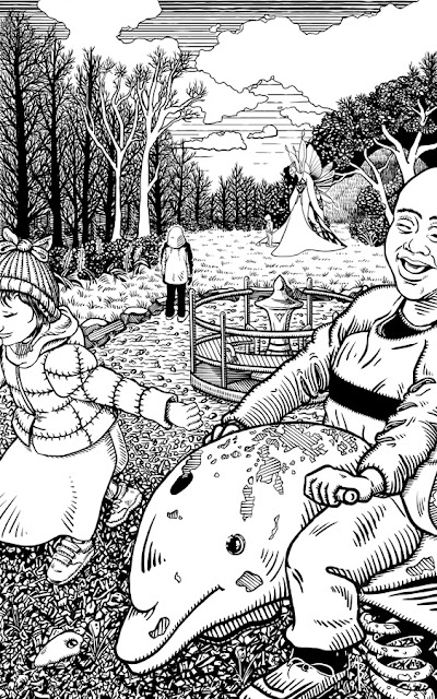
Eventually I decided to abandon interconnecting the set. In order to avoid jumping ahead of the story, I chose a moment which takes place sometime before the narrative begins --a playground, deceptively pleasant, but with something curious off in the distance. 


Early Fae sketch, too aggressive and inelegant.


While the illustration set will not interconnect, I did find a visual narrative to run through them, deciding that as the story progresses out of the modern world and into that of the Fae realm, I would transition the style. Hopefully, this will provide a nice otherworldly sense to the later half of the tale, and provide a unspoken contrast that these human creatures are not of this magic place. How well this will come across, we shall see. But taken as a set, I think it should work. This is why the fairy in this first illustration does not have the shading lines as the other characters. Things work differently in the realm of the Fae. It is also why I used a thicker pen for the modern world. It will help contrast the human characters later with their environment, and again, hopefully provide a sense of 'otherness.'


In the lower left corner of the illustration is a long, smooth hag stone. Why a hag stone? It's not part of the story as Sarah wrote it. Visually, I needed something in that space. Legend has it that hag/witch/adder stones, when viewed through the hole naturally formed within them, can reveal the hidden world of the Fae. I found it ever more tragic that the parent, who's point of view we take in the illustration, could have witnessed and perhaps even thwarted their child's abduction if only they'd known to look through that stone at their feet. Also, it fills that fucking gap in the lower left corner.

Sarah's story was so enjoyable on first read that I immediately pulled up Amazon and purchased her book The Imlen Brat with it's gorgeous illustrations and an memorable colophon of a seven-pointed crown over a jumping dolphin by Kate Baylay. I'd finished reading the book before I'd finished the illustration and there are a few less-than-subtle choices I made with that book in mind. Colophon is a lovely word, is it not?

Looking forward to continuing on this journey. I find it nice to have just one story to tumble around in my head over the next six months.