Thursday, August 17, 2017

Jack Bang's Eyes

R A Lafferty, Jack Bangs Eyes


Flip O’Grady was a chimpanzee of mature years and unusual intelligence. He stood a full four feet tall. He was employed as a penny-flipper at the “Probability Division”; it was under the directorship of Doctor Vonk, and so was Flip.
--R. A. Lafferty, “ Jack Bang's Eyes”

Upon reading Jack Bang's Eyes, I had intended to draw a full characterization of Flip O'Grady, coin in hand, peering at the reader with a hunched back and a knowing smirk. But then while doing some fast and fortuitous research on visual representations of probability I came across this outcome map of a coin toss. To me the map already looked like art. The shift from a full character to just a hand came as a means of adjusting to the pyramidal shape but also to help focus the viewer on the flipping of the penny.

The finished piece was created partly in vector and partly brushed into the computer.

Wednesday, July 26, 2017

Land of the Great Horses

Land of the Great Horses, R A Lafferty


A Carny in Nebraska lifted his head and smelled the air.
“It’s come back,” he said. “I always knew we’d know. Any other Romanies here?”
--R. A. Lafferty, “Land of the Great Horses”


I managed to grab a hardback copy of Dangerous Visions for almost nothing.  I flipped straight to this story, read the line quoted above, closed the book. It took a few days and a second reading to help understand some of the themes of the story. But for that first night, with a fire behind my eyes, all I knew was that I wasn't putting my head into my pillow until I'd drawn some depiction of a state fair.

Not my best work, but there are elements that I like.


Thursday, June 22, 2017

One At A Time


I have incurred a lot of ill will in my day, and sometimes it boils over. There was one time when a whole shipful of men had had enough of me.”
- R. A. Lafferty, “One at a Time”

Sometimes a single sentence is strong enough to burn an image into the mind's eye. This is especially true of Lafferty's writing, where every sentence seems to land a solid hit (or scratch, or tickle, depending on the author's intent) and every punch seems to come from a different direction.

There have been a few illustrations I've done lately where one might look at the work and think, “Strange, I don't remember that part of the story.” This is one of them.

Note how the sleeves attach and note the hammer at the tip of the belt. McSkee “The Odd One” has been taking it one at a time with many a day between.

This was also another example of me trying to find a faster route toward a finished illustration. The background was all drawn into the computer with a stylus, while the character was clicked into existence via vector graphics.


Thursday, June 15, 2017

Royal Licorice

 
He was decked out in Navajo beadwork and a Sioux war-bonnet when he spoke at the supermarket in Indianapolis. Indianapolis really meant Indian City, didn’t it?
---R. A. Lafferty, “Royal Licorice”


I read Royal Licorice just as the politicking engines were getting stoked for the 2016 presidential race. So perhaps it is no surprise that it was those aspects of the story that caught my attention and fed the illustration.

In the story, Candidate Johnson is a bumbling and disassociated sort of man. A political game player given renewed time with which to further bumble and dissociate himself (and appropriate other cultures for reelection).

I drew him with an disingenuous smile (referencing the lipless curl of a popular politician) and an even more disingenuous war bonnet; the feathers fanning outward like a peacock (or turkey?), disheveled, and incomplete.

Dressed a mess to impress the masses and failing horribly.


Tuesday, May 30, 2017

Ride a Tin Can


"Come all you little Singing-Pig-Shelni,” a bell man shouts. “Come get your free rides in the tin cans all the way to Earth! Hey, Ben, what other animal jumps onto the slaughter wagon when you only ring a bell?”

---R. A. Lafferty, “Ride a Tin Can”

This illustration came into being solely in the computer. No sketches beforehand, with only a rough idea of the moment in the story I wanted to portray. I'm not certain it works well without the viewers knowledge of Lafferty's heartbreaking tale. I'm fairly confident it jabs at the tender meat in the hearts of those of us who have.

You cannot see the faces of the Shelni (That's deliberate. This illustration has quite a few deliberates), but hopefully the ears are telling enough that these are meant to be the same Shelni that Jack Gaughan illustrated in the April 1970 issue of IF magazine.

So why not create my own vision of the Shelni? I love creating monsters. And the monstrous are often easier to create than animals or people. Here then is why I did not. Because, with Lafferty, I don't want islands. I want to help build up a whole. If we are playing and I'm putting my Lafferty LEGOs together, it's not satisfying enough to make my own little construct. I want my blocks to connect to other's blocks and theirs upon mine and so on, and so on, until a whole world is formed.

When I think of what I want for Lafferty and his legacy, it is an amalgamation of successes fans have had building communal worlds within the works of H.P. Lovecraft and Philip K. Dick. Cthulhu is now an established icon because people loved the design and kept building it into their works. Dick's stories are excellent, but needed reinterpreting/rebuilding through cinema to really widen the fan base.

Lafferty will always be a genius. But I fear he won't reach more people than already know him until the rest of us take that genius and built upon it venues which appeal to and draw in new kinds of fans into a greater, grander Lafferty universe.

At least, that's the fantasy -My R. A. Lafferty fantasy.

So, then, I loved drawing those big Gaughan Shelni ears; I loved alluding to Lissanne Lake's illustration for "Days of Grass, Days of Straw" in my illustration for "The Ninety-Ninth Cubicle." It's not much. But it's what I can do. 

Thursday, May 11, 2017

Ginny Wrapped in the Sun

R A Lafferty, Ginny Wrapped in the Sun


“Here come the religious nuts again,” Doctor Dismas said. “I may have to kill one of the fools if they keep coming back.” 

 - R. A. Lafferty, "Ginny Wrapped in the Sun"


Sometimes when I'm reading a Lafferty story I have a bad habit of focusing on the wrong parts, that is, if you can manage the argument that there are wrong parts in a Lafferty story.

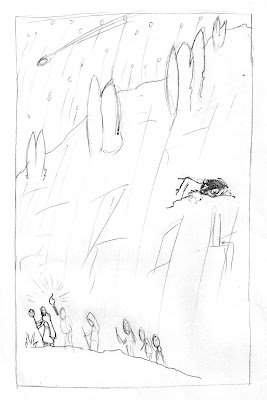
Reading Ginny Wrapped in the Sun, I hyper-focused on the religious zealots and their misguided and fruitless hunt up and down the mountain.

Two other things influenced the illustration. Namely, my having recently poured through everything I could find online of Harry Clarke's artwork (the designs with small figures in large landscapes were particularly in mind) and the other thing being that during this time I was trying desperately to find a speedier way to produce these illustrations.

Drawing in vector is somewhat tedious and does not have the pleasant pace and fluidity that painting or pen drawing can. It would take a week for me to finish a fully vector-drawn illustration. For this one, I tried merging vector and hand drawn and it still took a week to complete. So go figure.


Wednesday, April 5, 2017

Feast of Laughter Vol. 4


Feast of Laughter is now a four course meal!

After organizing, editing, and negotiating for a year, the Ktistec Press have gone to publication with the fourth volume in the Feast of Laughter series.

When we completed Vol. 3 of FOL I was under the impression that the books that followed in the series would be smaller in page count as the breadth of older, pre-published material we pulled from (making up roughly half of the total content) had been thought mostly exhausted. But within the crust of a flat Earth internet exist deep dark crevasses and in a few of these lay notable pieces written about Lafferty. This and the ever sharpening skill of the Kistec Team in negotiating rights to content (there's an essay by Gene Wolfe in there for goodness sake) led to Vol. 4 being the bulkiest book of the series, thus far.

Also included is the first ever publication of the original Lafferty short story The Rod and the Ring. Lafferty was prolific and had an enormous number of works published and a modest pile of works that were, for one reason or another, not. For us, it was very exciting to find out, over a year ago, that we would be the first to share this story with the world. And that excitement sustained itself throughout production -A new Lafferty and our labors forever listed with the "First published in" attribution. Wonderful.

It's also the first volume to feature a cover by artist Ward Shipman, who created a piece just for this publication (featured on the back cover). Ward's covers were another secret that we celebrated and giggled over for, in his case, well over a year. Many of the compliments we get on the volume begin with a comment about his cover. For my contribution, I did the cover layout this time around and was far too proud of the idea of hiding the title behind the mountains in Jeff's illustration. I suppose I still am.

Inside volume four there are also nine or so of my illustrations based on Lafferty's stories. In most cases, these are a little bit better than the ones I'd cut my teeth with in the previous volume. I will be posting more in this blog about the individual illustrations in the coming months. I will confess that I was trying to find corners to cut with the art this time around -Trying to weigh out how much of the illustration I could draw out in hand and still have that clean vector graphics look.

Feast of Laughter 4 was also the first volume in the series to run into a publishing hiccup, as sales were abruptly halted only a few hours after becoming available. We don't know if it was a random check or, if not, what made Vol. 4 different than previous books. But all movement was stalled until we offered validation that we had the rights to all the works in the book. It was a jarring start for what we had hoped would be a swooping debut for The Rod and The Ring. But, in the end, only tripped us for a few weeks before production quickly resumed.

And now it's finally out there. The Rod and The Ring. Ward's haunting cover. A few illustrations by me. All our art, our thoughts, and our hard work. Available for purchase on Amazon but also free in a pdf format from the FeastofLaughter.org website.


Friday, February 24, 2017

LAFFCON2


LAFFCON, R A Lafferty

The second annual conference dedicated solely to author R. A. Lafferty and his work will be held in Lawrenceville, NJ this June. This year I'll be in attendance. Again, the organizers asked if I would create the poster for the event.

The theme was to be Lafferty's book Fourth Mansions, a book I had yet to read.

Several chapters into the text, I will admit, I had difficulty finding good ideas for the event poster (Not that ideas weren't forming. Several illustrations in volume 5 of Feast of Laughter will now be based on this novel. Two have already been finished). The difficulty was pulling material from the book that could represent visually 1) the conference event and 2) the main theme (R. A. Lafferty). What became quickly apparent was that, like the LAFFCON1 poster, it was essential that Lafferty, the man, be incorporated. This led to sketches of various types wherein things weaved in and out of Lafferty's visage, animals leaped out of his open skull, and one sketch where the man just stood boldly holding a beer and grinning before a chaos of iconography behind him.

None of these ideas worked, at least not from my hands.

Eventually I asked myself the question, "If I did not need to include Fourth Mansions in the poster, what would it look like?" And that was all it took.


The new challenge was that I needed to do a couple of things I'd never attempted before. I would need to paint a portrait (I've painted objects and landscapes but never portraits). Also, I would would need to learn the tools for painting on the digital canvas. For Christmas I'd received a copy of Clip Studio Paint Pro (formerly sold as Manga Studio), finally installed it, and watched three or four times a Youtube video where someone using the same program painted a very convincing Ogre from World of Warcraft.


After that my poster progressed quickly. I cannot say enough good things about the software, it's intuitive tools, or it's reasonable price (currently around $25). I have a Wacom tablet, purchased during college, rarely used but kept pristine all these years in it's own black leather case (as any bad-ass graphic illustrator would do, yes?). I will say that painting digitally is not like painting in real life and has clear advantages and disadvantages.


I worked about 2 hours each evening for a week, experimenting and pushing digital paint. References were mainly from two images of Ray found online.

This is my fourth or fifth depiction of Ray Lafferty. It's a difficult portrait to nail down. There aren't a great number of pictures to pull from and Ray, in the latter half of his life and with regularly fluctuating weight, looks different in nearly every photo you find of him. I chose the healthy, full faced version.

As I painted, I was surprised how well it was progressing. I felt a bit like Jason Bourne discovering he knew how to kill a man using only a thimble. Had I been able to do this all along? -Not that the final image is without its flaws. It's still a first in many ways and shows it. But it's much better than I'd expected for so many firsts.

The text and layout were also added using the same software and, luckily, the conference planners were quick to forgive me for leaving behind the book theme.

The end product is, I think, welcoming. It's a little funny. It's secretly a "see what else I, Anthony, can do?", and, most importantly, it is a distinctly LAFFCON image. One I will remain proud of for some time.